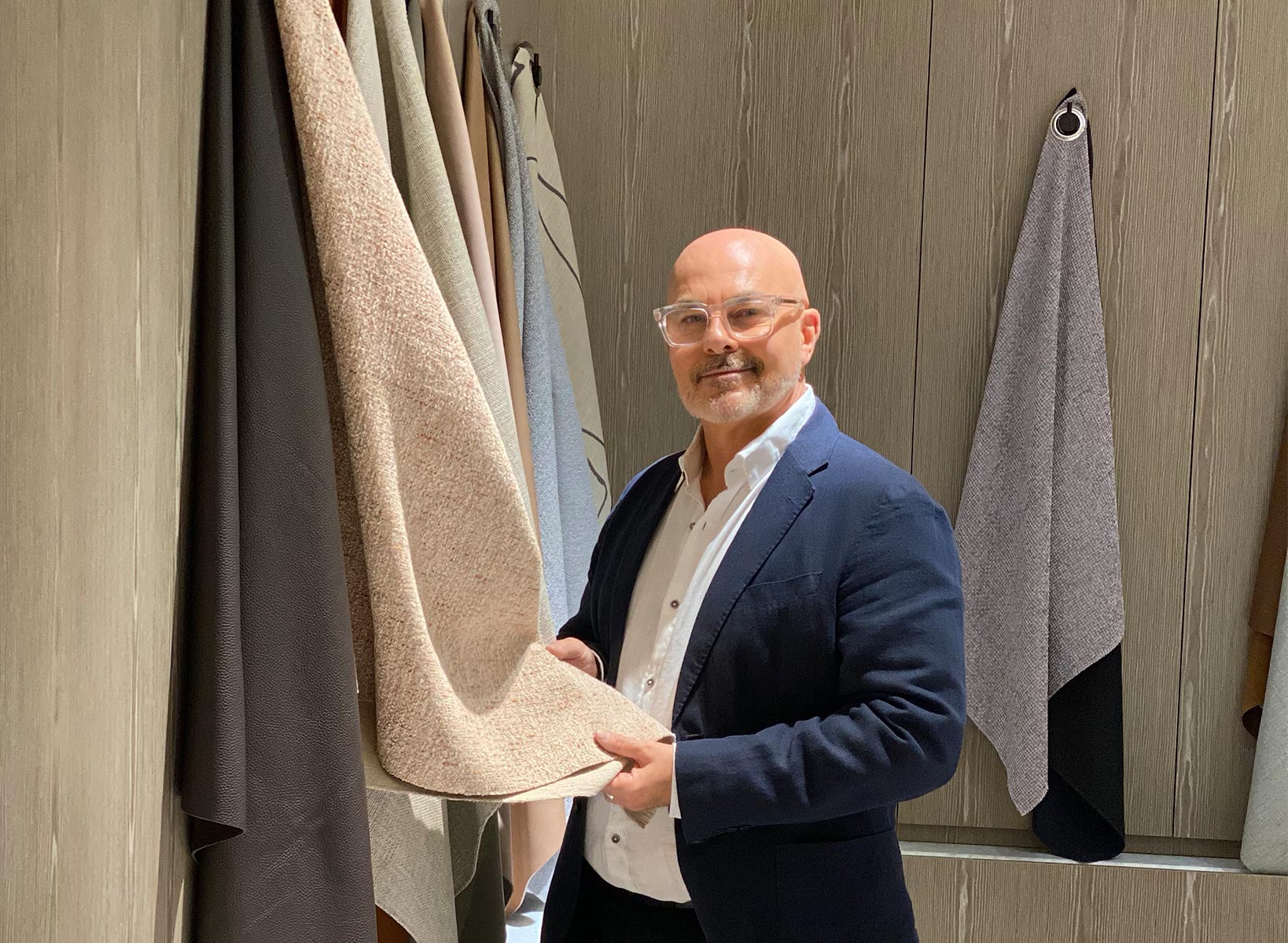
Neale Whitaker on working with pattern and a neutral palette
Recently, I read a very funny article by Kirstie Clements, a writer well-respected in areas of style, in which she lamented – as an avowed lover of colour and pattern - interior design’s ongoing romance with neutrals. ‘Beige, beige, natural, beige, off-white, beige, crème, and maybe throw in a bit of ochre’, wrote Clements (The New Daily, October 23 2021). ‘A rough-hewn ceramic objet, a jute rug, a branch, a hand-milled soap, a sand-coloured Turkish towel and voila, done.’ Well, I have to admit I have a foot in both the neutrals camp and the colour camp. I love both when thoughtfully mixed together (our work-in-progress country home is living proof) and happily confess to owning jute rugs, sand-coloured towels and more rough-hewn ceramic objets than you can shake a stick at. Or a branch.
The art of layering
But as viewers of The Block will have heard me say many times (and as Ronnie and Georgia’s house in the show’s most recent series demonstrated), neutral should never mean dull. Some of the most beautifully balanced and welcoming interiors are based on a neutral palette. The key is in the layering of complementary colours, materials and textures and the play of light (both natural and added) on those elements. And that layering starts with the floor. I can’t think of a better base for a neutral palette than the KING Indoor and Outdoor Rug Collections.
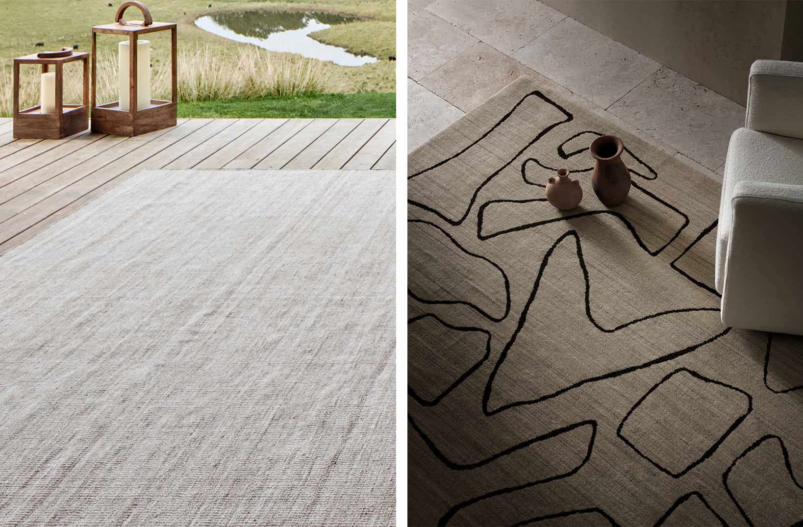
Featuring Avalon Outdoor Rug in Granite and Oceania Rug in Terra Firma.
A neutral palette can be based in colour
Earlier this year I presented an online design masterclass where I talked at some length about neutrals. Describing them as interior design’s ‘comfort zone’, I explained how the neutral palette extends far beyond the beiges and naturals that always spring to mind. Greys are neutrals too, as are sage and olive green, warmer shades such as brick and terracotta and the soft caramel and latte hues we’re seeing currently.
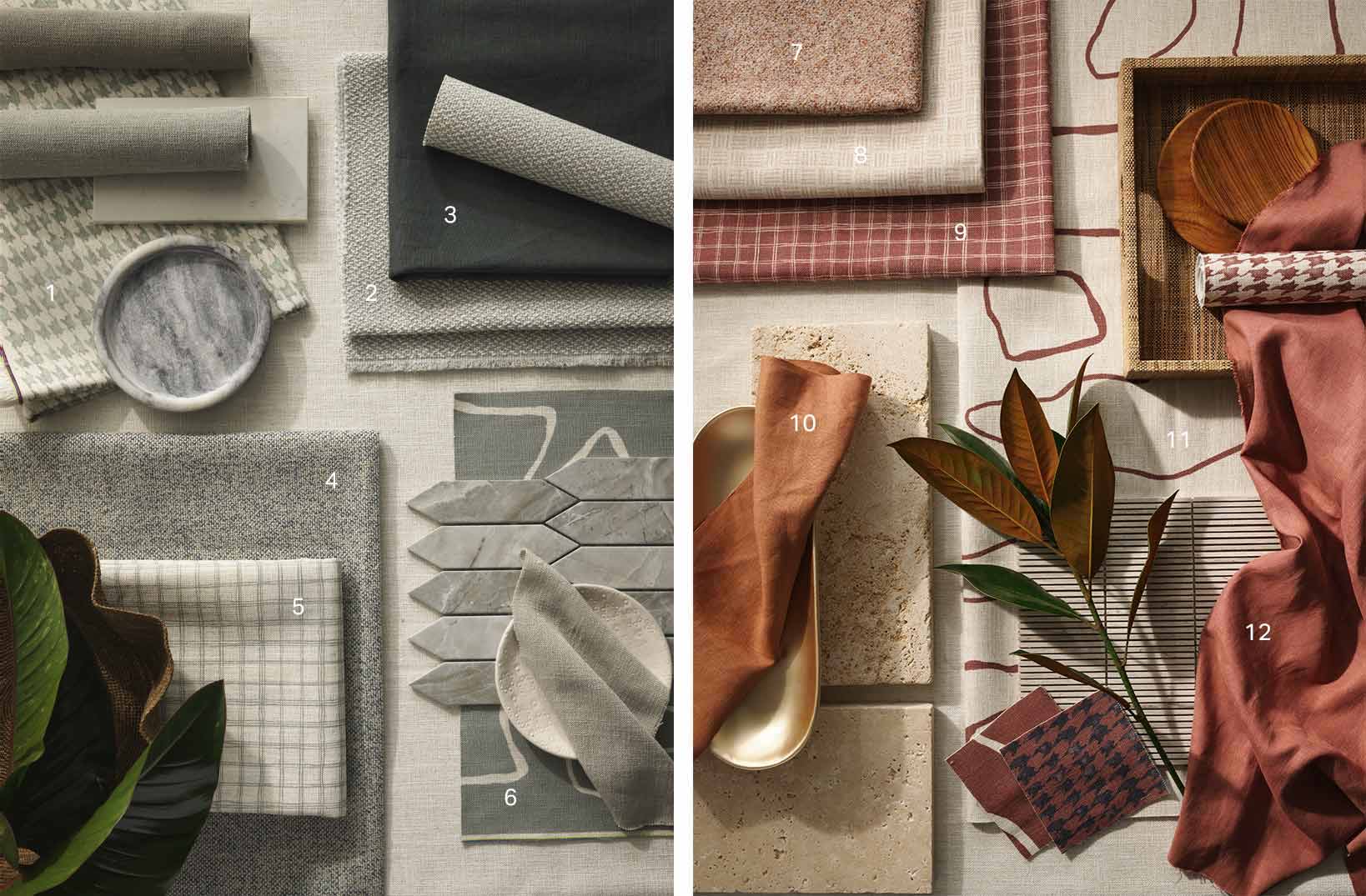 Curated mood boards showcasing new KING fabrics. Left: 1. Avoca Sage 2. Boyd Autumn Mist 3. Peninsula Linen Tasman Storm 4. Quinn Ocean Breeze 5. Eden Check Sage 6. Oceania Sage. Right: 7. Olley Spice 8. Seidler Dune 9. Eden Check Deep Russet 10. Peninsula Linen Raw Sienna 11. Oceania Clay 12. Peninsula Linen Deep Russet.
Even more surprisingly perhaps, blacks, charcoals, deep navy blues and rich browns can also be described as neutrals as they team so effortlessly with myriad colours and patterns. Neutrals don’t sit on the traditional colour wheel, but they have hints of colours that do and this is where alchemy occurs. A blue-based palette will blend happily with grey-based neutrals and cool whites, while red-based colours team perfectly with warmer whites, soft caramels and natural linen shades.
Layering patterns for a harmonious interior
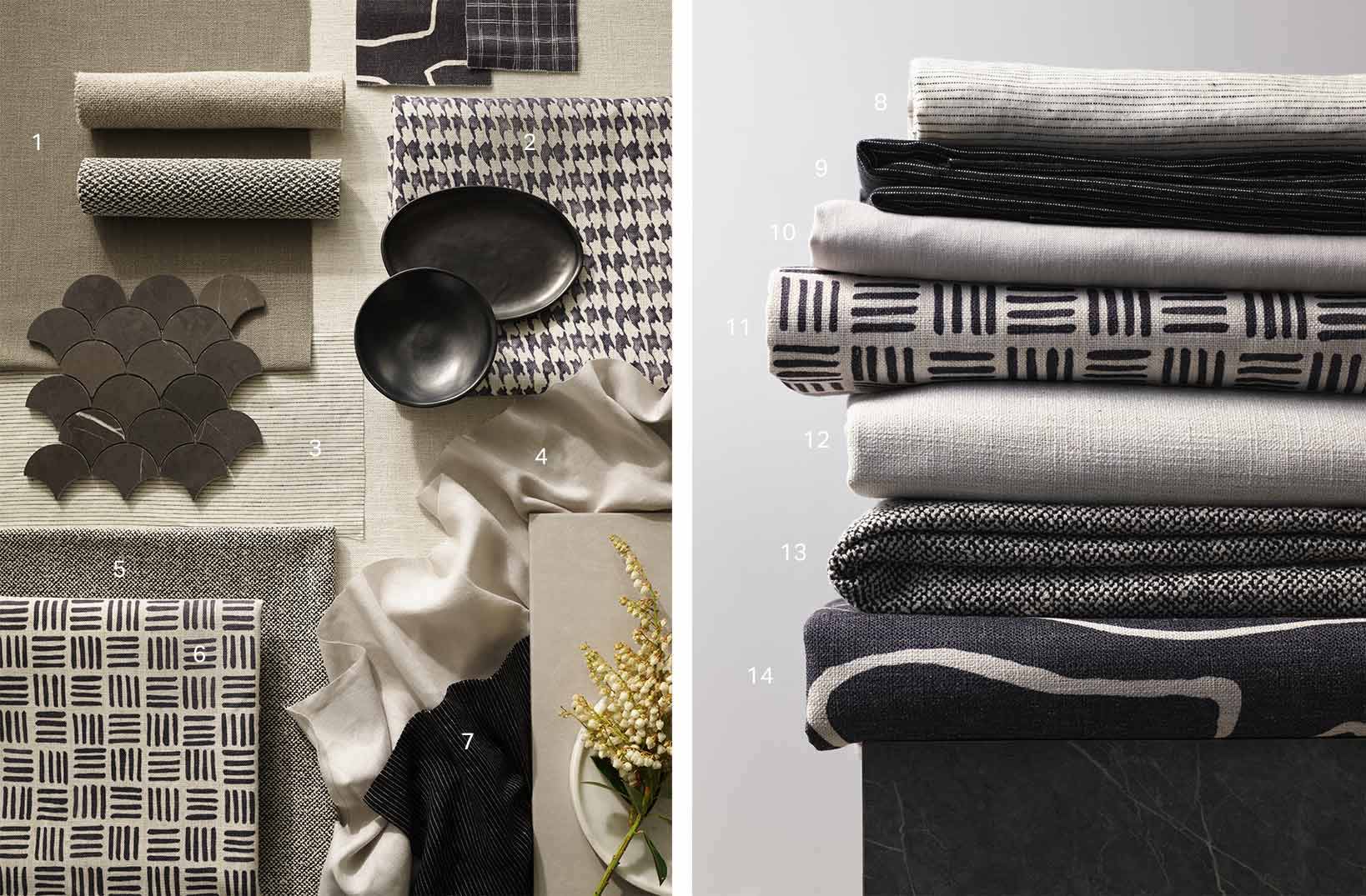
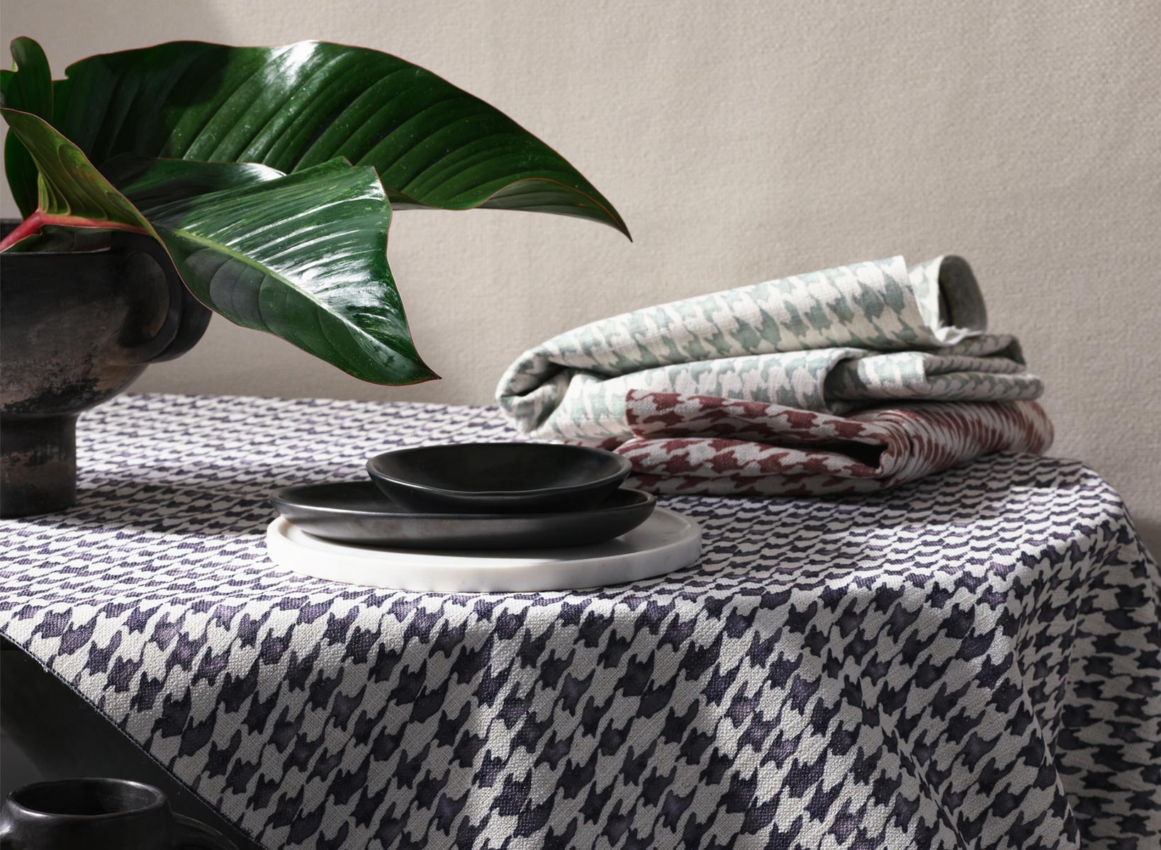
KING are masters of what I sometimes call ‘neutrals plus’, understanding that impact and harmony are created through the subtle play of texture, weave, shade and pattern. There’s no rule that says a neutral interior can’t include pattern, although my advice would be to err on the side of simple patterns in complementary shades. If we apply the time-honoured 60/30/10 rule, then I suggest combining 60% textured plain fabrics such as KING Boyd, Quinn or Peninsula Linen, mixed with 30% toning plains such as Peninsula Pinstripe and 10% pattern from new designs in the KING Fabric Collection like abstract Oceania, industrial Seidler, Eden Check or - my favourite - Avoca houndstooth. In shades like clay, sage and dune, these will add depth and impact to a neutral interior without upsetting its balance. Those ratios will work to create a base, but remember there’s no ‘formula’ for an interior, nor should there be. One person’s neutral is another’s rainbow. Or maybe neutral is in the eye of the beholder. You get my drift.
Neutrals are timeless
There are lots of reasons why neutrals are a popular choice. For sure, they allow us to sidestep any hesitation about bold colour or prevailing trends, but they also create a calming retreat from a world that often feels as chaotic as it is challenging. And for many of us, neutrals symbolize the handmade, the artisan, sustainable and authentic, in contrast to a culture that was (pre-pandemic, at least) fixated on the disposable and transient. For me, there’s something timeless and reassuring about a neutral interior, knowing as I do that it will look warm and cosy with winter’s firelight, or cool and airy in the heat of summer.
Just as natural make-up requires skill, neutral interiors are not quite as simple as they appear. There’s a subtle complexity beneath the surface, but perhaps the best way to approach is organically - a neutral interior develops best over time. And don’t impose too many rules because in general terms, a neutral palette is giving you permission to explore and experiment. In 2020, I styled the interior of a contemporary oceanside home on Sydney’s northern beaches. The neutral palette used throughout allowed the ocean to star, but the interior still felt rich and layered through the inclusion of linen, timber, leather, ceramics, basketry – even brass – and of course, amazing natural light. Hints of soft colour and pattern were added through artworks and accessories, creating a home that felt nuanced and cohesive.


